Intelligent Report
Smile With ConfidenceDescription
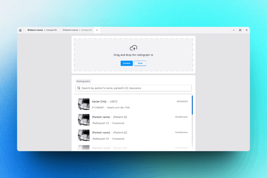
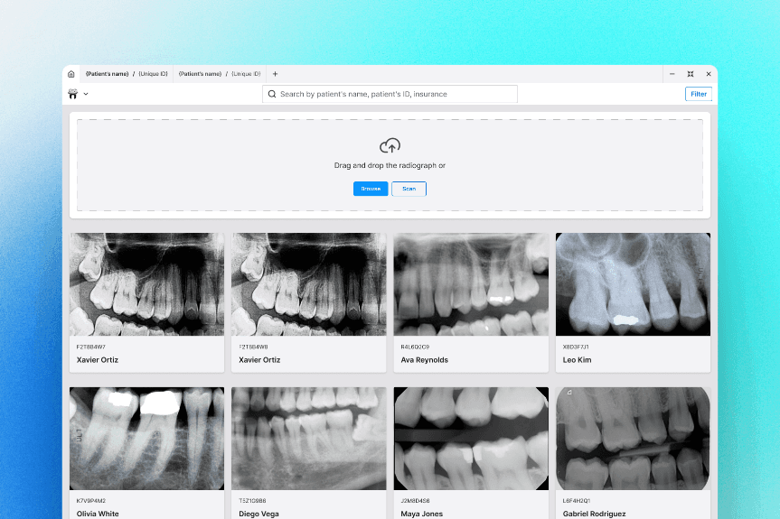
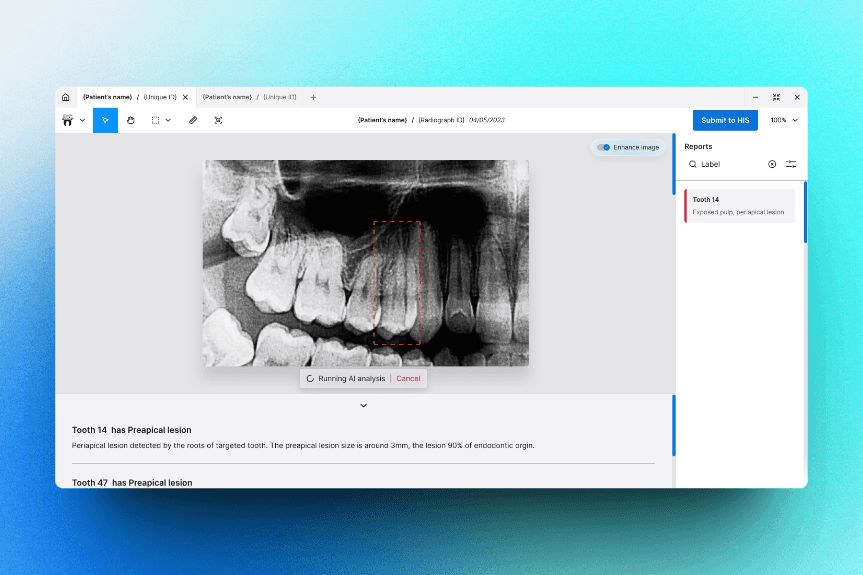
A desktop application, for MacOS and Windows, to boost dentists to report dental problems on radiographs using AI.
Context
As solo freelancer Product Designer I helped Smile With Confidence craft a better
experience for their previous demo product and turn it into an final version, with more
effectiveness and usability for their users. My focus was to improve the user journey to
report dental problems, make the software feels more quick and improve the product's
aesthetics.
The new version of Intelligent Report is inspired by some design tools to solve some
information architecture and layout organizing problems. Also, the new version uses almost
the same features from demo version, but making them more easier to use and requiring less
clicks to do each action. I also suggested some new features as autocomplete and store old
reportings on software's history to better provide a user journey.
Process
I start analyzing the demo product, each step on user flow and features, gathering pain points
on that journey. Also me and SWC collected feedbacks from users of the demo version of SWC's
product to have in mind what we could improve from what we already had. After that I did a
research to discover other tools avalible on market that offers the same or a similar service,
doing a competitive audit and documenting it to know what we could improve and make better on
SWC's product.
With the data we collected, we had enough information to proceed to an ideation process, where
me and SWC's team spend sometime doing a brainstorm together to reach some solutions for our
pain points. The result of that was some ideas of how we could reorganize the product to be
more effective than before.
Solution
First, I started crafting an new UI kit, including both styleguide and component library, that offers better accessibility and is more aesthetic than the previous version. After that I spent sometime reimagining how to build almost the same feature tweaking for improvements and reorganizing to be more effective. With our goal in mind, I designed an wireframe and hi-fy prototype reducing the user journey and efforts from 7 steps to 4 steps.